

Five Common Website Mistakes That Are Hurting Your Sales (And How to Fix Them)
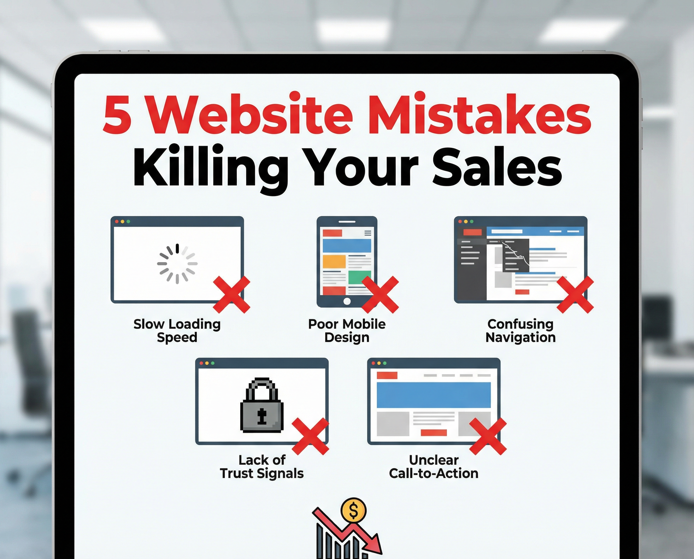
Five Common Website Mistakes That Are Hurting Your Sales (And How to Fix Them)
Hey there! If you’re running a business with an online presence, you probably think that your biggest hurdle is attracting more visitors to your website. But here’s a little secret that many companies don’t realize: it’s not about more traffic, it’s about better conversions. Simply put, if your site isn’t turning those visitors into paying customers, you’re leaking money—maybe without even knowing it.
So today, let’s talk about the five most common website missteps that are silently sabotaging your sales—and what you can do right now to fix them.
1. Slow Loading Times: Speed Isn’t Optional Anymore
We live in a world that moves at lightning speed, and your website has to keep up. Research shows that over 40% of visitors will abandon a site if it takes more than three seconds to load. That means slow pages don’t just frustrate potential customers—they drive them away before they even get started.
Why speed matters:
-
Impatient visitors bounce quickly
-
More exits mean fewer sales
-
Google penalizes slow sites in search rankings
-
Poor user experience ruins your brand’s first impression
How to get your site sprinting:
-
Optimize images without sacrificing quality
-
Keep your website code clean and lightweight
-
Upgrade your hosting plan or server if needed
-
Enable caching to reduce load times
-
Cut down on unnecessary plugins that bog your site down
A fast-loading website isn’t just nice to have—it builds trust instantly and keeps visitors engaged.
2. Missing or Confusing Calls to Action (CTAs)
Ever landed on a site and wondered, “What should I do now?” If your visitors face that question, you’ve lost them. Clear CTAs guide your audience towards taking the next step—whether it’s booking a call, requesting a quote, or buying a product.
How unclear CTAs hurt you:
-
Visitors get confused and leave
-
No clear direction means no sales
Making CTAs work for you:
-
Use big, bold buttons that stand out
-
Place CTAs above the fold so visitors see them right away
-
Repeat the CTA in key spots throughout your pages
-
Use action-oriented text like “Get Started Today” or “Request a Quote”
Your website should feel like a helpful guide, not a maze.
3. A Mobile Experience That Misses the Mark
With over 70% of users browsing on their phones, a website that doesn’t shine on mobile is practically invisible to most customers these days.
Common mobile site headaches:
-
Text too small to read comfortably
-
Buttons crammed together, causing accidental taps
-
Slow loading speeds on mobile networks
-
Broken layouts that look chaotic on smaller screens
How to mobile-proof your site:
-
Make your design responsive—so it adapts seamlessly to any screen size
-
Test your site on multiple devices, not just your own phone
-
Optimize speed specifically for mobile users
-
Create layouts that are clean, simple, and easy on the eyes
Mobile optimization isn’t “nice to have” anymore—it’s your digital lifeline.
4. Lack of Trust Signals
Your website doesn’t just sell a product or service—it sells trust. If your site feels empty or vague, visitors won’t bite. They want reassurance that your business is real, competent, and reliable.
Missing trust signals cause hesitation, which kills sales. Here’s what your website should showcase:
-
Real client reviews and testimonials
-
Logos of clients or partners you’ve worked with
-
Case studies showing before and after results
-
SSL certificates to keep data safe (that little padlock icon)
-
Clear, easy-to-find contact information
Bonus points: Integrate Google reviews to bolster credibility even further.
Showing off trust signals isn’t about bragging—it’s about making people comfortable enough to take the next step.
5. Ineffective Landing Pages
Running ads and directing traffic to your homepage? Stop right there. Your homepage is meant to be broad and welcoming, not a laser-focused sales tool.
Why generic landing pages fall flat:
-
Messages that are too vague
-
No tailored offers to entice visitors
-
Lack of a clear answer or next step
How to craft landing pages that convert:
-
Create a unique page for each service or product
-
Write a strong, benefit-driven headline
-
List clear advantages your offer brings
-
Include proof like testimonials or case studies
-
End with one strong, unmistakable call to action
Great landing pages act like a welcoming salesperson—they answer questions, build interest, and guide visitors right where you want them.
Your website shouldn’t be a static brochure gathering dust online. Think of it as your 24/7 salesperson, ready to convince visitors to become customers every moment of every day. If you’re not seeing steady sales or leads coming from your site, it’s a sign that there’s something to fix—but the good news is that every one of these issues is absolutely solvable.
Whether you’re using Shopify, WordPress, or custom-coded solutions, a well-built website that focuses on speed, clarity, trust, and mobile experience becomes a powerful engine for growth.
If you want a fresh perspective, consider getting a free website audit. Here at Social Mosquitoes, we’re an agency in Delhi that builds websites designed to make your conversion rates better and boost your sales.
Thanks for reading! Next week, we’ll dive into how to optimize your WordPress site for even better performance—stay tuned.
Until then, keep fine-tuning and turning those clicks into customers!